The Program.

I don’t actually watch feature films that often. I seem to be hypercritical to the point that my suspension of disbelief can be thrown by a minor detail, and the film can loose me in an instant. But thanks to BA’s inflight entertainment, I chose to watch Mr Sherlock (pity, pity they couldn’t be bothered to get a script written, nor have a photograph made which looked vaguely authentic, when so much work went into the rest of the film. Spoilt by two rather important ‘features’), and Frears’ The Program.

Last year The Program (2015) was released, and I don’t recall hearing much of it. Frears was—I had thought—a respected director. My first perplexity was with the American spelling of the title of a British film, but I know, that is just one of my pedantic pet hates.

Frears would have been aware that in making a film about a hugely controversial person of recent history, who is the subject of many articles, books and documentaries, his own creation would be under strict scrutiny. He chose not to take the creative license of fully fictionalising the story ‘loosely based on the life of Lance Armstrong’, but rather went down the route of the docudrama.

My opinion of the film is that the writing is very poor, making the narrative feel rushed and compressed. It would have been more interesting to focus on a part of Armstrong’s life or career, and build characters well enough that some empathetic connection could be made: this seems to be a common shortcoming, as though it were impossible to direct the empathy of a viewer within a non-fiction narrative. Nonsense. Cinematography was half decent–the race footage was well crafted, though the use of two ‘artsy’ shots seemed out of place (one close wide-angle shot of the journalist under fire, one sunset backlit shot of Lance). Production design was very poor, with many inaccuracies which were clearly going to be shat on by the cycling community. Sound design was—let’s say—creative.

Three particulars which stood out for me were:

In the opening shot—an artsy slow-mo of Lance cycling up a hill—the chain noises were oddly in your face, synthetic and totally uncharacteristic of a racing bike. Lance was famed for his cadence and fluid pedal stroke, not a slow clickety-woosh, clickety-woosh. these sound effects were used consistently through the film, which could be viewed as a good or a bad thing.

So Lance gets cancer, then he pesters Dr Ferrari into making him a winning cyclist. I have no idea why everyone insisted on his name being Michela Ferrara. These scenes presented a shocking historical inaccuracy, as Lance was pedalling on a turbo trainer with Ferrari talking about what they would do: the bike on the turbo was shown clearly to have a Hollowtech II bottom bracket (detail shot), which Shimano launched in 2003, this scene would have happened around 1997-1998. The film chose to focus on Ferrari’s use of drugs to cheat a performance increase when he also found that Armstrong’s loss in muscle mass could be compensated for by using an increased cadence. Thanks to Ferrari’s insight, Armstrong was the first cyclist in the professional peloton to use a high cadence (over 90rpm) which is today’s norm. They did briefly touch upon USPS’ revolutionary team tactics (also standard today), but chose to leave these two important details in the shadows, rather than focusing on them, which could have been interesting.

An editing mistake which would have thrown anyone of a non-mechanical persuasion was the springboard of Armstrong’s first post-Ferrari stage win: he’s at the back of the peloton with the team car: the mechanic reaches round and (detail shot) tweaks the cable pull on his rear-mech, which then catapults Armstrong’s performance past everyone to the win. Really?

The film left me feeling much the same as I felt after seeing 127 Hours (2010): baffled by the lack of character development, and disappointed that the film didn’t even try to suspend my disbelief.

Tobias Feltus:
Share

BAFTA

A few of you may know that I was the Production Designer on the 3rd series of the Ooglies, produced by Ko Lik Films for CBBC. Last night Ooglies won the BAFTA, which is fab, amazing, epic and swiiit!

If you are in the UK then you can watch Ooglies BBC iPlayer.

Ooglies BAFTA

Tobias Feltus:
Share

Form or function.

A couple of weeks ago I was talking to Ross Hogg about the BAFTAs which Monkey Love Experiments had just lost. The conversation steered towards what is in essence the same discussion that architects and furniture designers often debate: whether form should religiously follow function or material attributes. Talking about a film the discussion becomes whether the technique chosen should complement the narrative (or the narrative influence the technique), or whether – as an animator – you just use your technique to tell any given story.

Ross’ work is very textural, and his approach is to start with a story, and then find the textures and techniques which will work to help the story to thrive. This allows his work to have a very intimate feel to it, even if the story is not personal. The thing that was amusing in our conversation was that he saw this as being the best approach, whereas I don’t see any problem with adapting a story to fit a technique. Problems arise when technique and product don’t have any logical link and – in fact – it would be more practical to make the product in a different way altogether. I think that Monkey Love Experiments is a good example of how techniques can be mixed to tell a story in a hyperreal manner. We were able to manipulate physical space through photography and editing, use live-action to tie the space and narrative down to known reality, and insert stop-motion animation into this setting, making Gandhi very alive.

In design, a good example of the marriage between form and function is what happened in the Bauhaus era with an example like Breuer’s B34 chair, a structure that could not have been made before the development of tubular steel and which expresses the material without any embellishment. Conversely unconnected designs are represented by most of what surrounds us today, as most products are decorative boxes styled by zeitgeist-trends to sell technology which an accountant and marketing manager have decided is what we are to be rationed, rather than what industry is capable of. Often what we think of as ‘good design’ today is something that is aesthetically neutral. Though Jonathan Ive’s Apple products look at home in Tadao Ando’s architecture, there is something infinitely more honest about making a statement with materials as the fabric of the design of a building. The design of electronic devices is ethically no different no steampunk styling.

I do get excited by hybrid workflows when they do add to what you are able to achieve. Around a year ago I commissioned Jared to make Lauren’s engagement ring: I knew he was the right person to take on the job because of his background working both with fine jewellery and with the machine-shop end of piercing jewellery. This was pertinent because the ring in question is a palladium cast of a cable-tie (or zip-tie) set with a diamond. It so happened that we were visiting his workshop when he was starting to experiment with an interesting workflow. He’d been commissioned to make a rather large ring, and had started building it in silver using traditional techniques, chasing, piercing and brazing from sheet material. But he was also experimenting with the jewellery package in Rhino 3d, and subsequently he had the ring ‘printed’ from wax: he was able to optimise the material thickness much more delicately than he had been able to in the traditionally made ring, which was exquisite when investment-cast: a technique that is more than 5000 years old. I think this is the first time that I have seen stereolithography (3d printing) used effectively as part of a process, rather than being used for the sake of its existence.

I have been asked if I had ever used stereolithography in any of my work, and I haven’t mainly because I have not seen a need for it, or a need that exceeded the tedium of creating a 3d model and getting the print made. Joseph and I had looked into it back in 2005 when we were working on Solo Duets, but found it to be more efficient to sculpt a portrait. Basically we wanted the puppet to be a portrait of Joseph, but at 1:6 scale. We’d even had a 3d mesh made of his face using what we were able to access, but I ended up just spending a couple of evenings sculpting a bit of clay, as computers of the era didn’t seem capable of handling the 6 million floating point mesh that we had of Joseph’s face, and we’d already wasted weeks on this approach. Materialise had been available as a stereolithographic facility for years, but for what we needed oldschool techniques were faster and probably offered finer detail. I didn’t understand at the time, however, why figurines from games (or films) like Final Fantasy and Toy Story weren’t printed directly from the models used to make the films, but rather seemed to be interpreted by sculptors and rarely looked like the film characters.

I seem to have ended up on a tangent involving animation and stereolithography. I would be curious to see the process used within filmmaking, but it would have to become a completely inherent part of the process. Most of the time you start with hand drawings or sculptures to develop a 3d model anyway, and this is why I don’t often see a point in making a 3d model in order to create a sculpture unless there were another reason to have the 3d model in its own right. For example it might be an interesting addition to the workflow of making a film to use Machinima as a storyboarding technique, with the intent of then printing puppets and using stop-motion to produce the final product. The occasionally arbitrary aspects of Machinima could add an interesting layer, either helping to homogenise conflict of opinion, or even helping work out the timing of movement, since the gaming engines all have physics of movement already built into them.

In conclusion, there never is an absolute right or wrong, but as I wrote yesterday it is often worth thinking about why you might chose to do something one or another way, and be ready to explain it. Most often it is good practice to chose to do something in a logical and complementing manner – and often the simplest approach will be the most rewarding. Occasionally it is worth looking at an approach that is a bit awkward but that will add an interesting quality to that which you are doing. Unless you are at the forefront of something completely outrageous like Memphis, it is rarely worth spending time on something which is destined to become outdated at short notice, unless you are comfortable adapting ahead of the trends you might be contributing to.

Tobias Feltus:
Share

Ooglies (Updated)

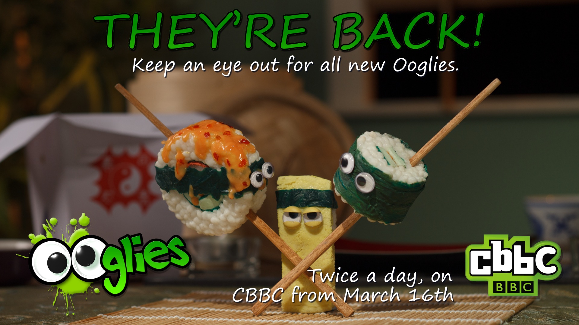
In 2014 I worked with Kolik Films Two Ltd as the Production Designer on the new series of the Ooglies for the CBBC. This was the first time that I’d worked on such a large department, and it was quite a privilege to be in a directorial position as a head of department – something I am only used to when I have no one below me. My team was fantastic, and the series is an epic piece of children’s splatter-horror of the vegetable kind.

So, in mid March CBBC broadcast all 20 episodes of our Ooglies and – yes – it is amazing! Yes, I am saying that silly kid’s TV is amazing, but on the whole, it is. Non-verbal splatter-slapstick. How much better can you get?

Some of the specific things which I built are the takeaway box in the background of this image, the Toast Soldiers’ helicopter, Fish Finger’s butter-boat, Slippy Nana’s unicycle, Dr Whobarb’s cheese-grater Daleks… And the last thing I made was Parsnip’s hair-straightener crocodile. As the head of department I didn’t get much of a chance to make things, as most of my day was spent overseeing the logistical structure of how the series was going to be shot. We had around 6 animators working at all times in blackout ‘tents’, and building a staging system that everyone was happy with did take some fiddling.

Tobias Feltus:
Share

Monkey Love Experiments

Monkey Love Experiments from ainslie henderson on Vimeo.

Last summer, Ainslie, Will and I embarked on a rather ambitious film, Monkey Love Experiments. I built the sets as well as acting a leading role. The film mixes stop-motion animation and live-action to a very delicate and real degree.

Monkey Love Experiments won the Scottish BAFTA for best short animation in 2014, and was nominated for the BAFTA 2015.

(updated with full film 16/7/17)

Tobias Feltus:
Share

James – Moving On

March and april were taken up partly by the making of a new music video. Ainslie asked if I could build sets and props to build a coherent world made of yarn. At this point the video has been viewed somewhere near 400000 times, in three weeks.


Moving On from ainslie henderson on Vimeo.

Tobias Feltus:
Share

Seven, with Poppy Ackroyd.

A few weeks ago I shot this video with Poppy and John at the Witespace Gallery, in Edinburgh.

Seven from Poppy Ackroyd on Vimeo.

I shot it with available light, with the GH1 mainly handheld, wide-open with the Nikkor AF-D 50/1.4. I think we ran through the track four times, to make sure I’d have enough redundancy to make a decent cut of the track.

As per my usual, I edited in Final Cut Express 4.0.1. I decided to transcode the AVCHD footage to AIC for simplicity, and since I’d exposed the footage pretty light, I didn’t feel I would loos any dynamic range in this conversion. I think I was right, even though the whites did display some banding, both before and after transcoding.

The colour grading was done using free filters. To do this, I make a new Sequence, and slap the edited sequence in the new sequence’s timeline, and do all of my grading on this encapsulation of the editable edit. Firstly I increased the exposure with Image Control/Brightness. Then I used CHV/Silk and Fog, radio-clicked for “silk”: I used this to subtly make a little bit of glow on the highlights, which made the footage look a bit more filmic. I then used CoreMelt’s Pigment RGB Levels and Curves to adjust the exposure curve. This is – so far – the closest I have found a video filter to work like Photoshop’s curves, though it is still limited. I then converted the image to B&W using TMTS Color’s Black & White, which gives you a good RGB mix in the monochrome conversion, so you can make skin tones look smooth.

I’m quite pleased with how the high-key look came out, using only available light and manual controls. If you use Final Cut, you might as well download these free plugins, as they do seem to perform pretty well.

And of course, look out for more from Poppy HERE.

Tobias Feltus:
Share

‘Here We Are’ in Rolling Stone Magazine!

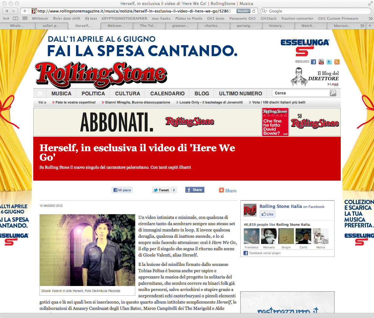
Surely the best way to launch a new music video is, indeed, to have it on the Rolling Stone magazine’s site, complete with a review and praise.

Rolling Stone Magazine

You can read the article HERE, and read my English translation:

Intimate and minimalist, the video has something cyclical about it, which gives the impression of repetition of the same images played in a loop. And yet something de-rails, something unexpected happens, but you’ll only discover it by paying close attention: and thus Here We Are is the video for the single which marks the return of Gioele Valenti as Herself.

The mini-film created by Scottish [talent] Tobias Feltus serves well in understanding and appreciating the music of the Palermo-based solo artist, who seems to ride on well-trodden folk paths, enriched and occasionally interrupted by exciting canterburian echoes or gothic elements. This fourth album, simply titled Herself, sees collaborations with Amaury Cambuzat of Ulan Bator, Marco Campitelli from The Marigold and Aldo Ammirata.

As for the filmmaker behind the video Rolling Stone is premiering, Feltus is also a photographer and designer, known for his work with bands like Aereogramme and Lord Cut Glass under Chemikal Underground Records (the label of the ex-Delgados who have Mogwai and Arab Strap in their roster, and who launched Interpol). Aside from numerous exhibitions of photography in the UK and Europe, his resume also boasts the production of Solo Duets (2005), which was nominated for the Nastri d’Argento, won Best Animation at the Krakow Film Festival, and won Best Short Film at the Festival Du Cinema Italien at the Espace Pierre Cardin in Paris.

The video can also be watched on the Rolling Stone webpage.

Tobias Feltus:
Share

The Making of Longbird: A Retrospective

Last night we were told of this wonderful review of our show at the Inverness Museum, written by Georgina Coburn.

WINNER of the Short Grand Prix at the Warsaw International Film Festival 2011, the Golden Dove and Audience Awards at the Leipzig Film Festival and nominated for a New Talent Award 2011 by BAFTA Scotland, Will Anderson’s animated docu-fiction The Making of Longbird is the centrepiece of an intriguingly multi-layered exhibition.

WILL Anderson, in collaboration with Tobias Feltus and Sophie Gackowski, has constructed artefacts and ephemera to conjure belief in the existence of a master turn-of-the-century Russian animator Vladislav Alexandravich Feltov, creating a fascinating “Retrospective” which explores artistic persona, collective memory and the nature of cinema.

When seeing each object the viewer begins to question the narrative labelling of each piece as part of a larger authenticated fiction in the museum/gallery space. There are many layers of enquiry here; a combination of historic fiction, artistry and playful deliberation that together with the choice of techniques and presentation of objects explores our relationship to still and moving images as repositories of human memory.

Tobias Feltus and Sophie Gackowski’s forged family photographs of the great Feltov utilise early photographic techniques pioneered in Scotland in the 1830’s, fixing shadows of identity in a series of cyanotype prints. The use of early photographic techniques presents an interesting counterpoint to Anderson’s dialogue of resurrecting the animated fragment (of a cinematic work of fiction) and “modernising” it for a contemporary audience. Use of digital techniques coupled with the deceptive simplicity of scissors and paper give Anderson’s work an immediacy and creative integrity that define him stylistically.

The notion of a “masterpiece”, authenticity, authorship and the artist as creator are interwoven with self consciousness and humour in Will Anderson’s presentation of himself and his creation, Longbird. What shines through is Anderson’s emerging talent as an artist and animator. The musician Martyn Bennett once said that in order to be pioneers we first need to acknowledge that we are heirs, and this ethos certainly resonates in Anderson’s intelligent, comic and imaginative film, evoking the inherent magic of early film and photography.

The opening sequence (Anderson’s creation: a fragment of Feltov’s masterpiece which has presumably survived the “Great Fire”) is incredibly fluid and beautifully realised, an almost kaleidoscopic vision flickering to life, marks of dust and time creating the illusion of aged celluloid. The way that Longbird picks up the edge of his own frame of reference in silhouette and curls in on himself is an apt metaphor for the explorations of the artist.

This curiosity is a major strength in terms of Anderson’s evolution as a unique creative voice. The angular morphing of imagery reminiscent of German Expressionist design and imitation of physical decay visualised in the projection itself, authenticate the film as belonging to another era. Sound also succeeds in placing the audience in another age with crackling cylinder, the audible clicking of a speeded-up projector and silent era piano accompaniment halfway between musical hall and cinema.

What follows Feltov’s Longbird is part documentary; “archival” footage of Feltov at work and the documentation of Anderson’s attempt to bring Longbird back to life with lively exchanges between the animated character and artist. Longbird makes his debut on “Chitter Internet Video” before being killed off by a cue from the script and a recreation of the famous fire that destroyed much of Feltov’s “original” work of genius. Also screening in the gallery space is an interview between Media critic Anslie Henderson, the artist and Longbird voiced in a thick Russian accent, the animator letting his creation out of the box.

Although many of the labels on objects are infused with the joke of fiction permeating the whole gallery space there is something quite poignant about the display of film equipment and memorabilia now seemingly rendered obsolete in a digital age. An 8mm editor and viewer, an invented “Feltotrope (c.1887) evoking early moving image viewing devices from the Victorian era and the presence of architectural drawings, photographs and seating from the old La Scala Cinema in Inverness, anchor this loss in living local memory.

Screening with Anderson’s “main feature” in the small gallery cinema are a series of animated films from Edinburgh College of Art graduates past and present, including Joseph Feltus’s wonderfully ambiguous Solo Duets, Jessica Cope’s The Owl House and the poetic simplicity of Adore by Michael Hughes. Solo Duets is particularly beguiling in its haunting use of waxen human figures and interior scenarios.

It is exciting to see these films by Scottish based animators in the IMAG gallery space and hopefully the venue will be able host further showcases of such work, bringing it to the attention of a wider public audience. It is also extremely encouraging to see Will Anderson’s exploration of craft, memory and perception at the heart of The Making of Longbird recognised both locally and internationally.

© Georgina Coburn, 2011

Originally posted on Northings.

Tobias Feltus:
Share